In November 2014 Bay Photo Labs introduced a new MetalPrint surface called “Mid-Gloss”. It is touted as being in between their “Satin” and “Glossy” finishes and to quote them it’s a perfect balance of both:
Too glossy? Too matte? Well you’ll find this one is just right! Our NEW Mid–Gloss Surface for MetalPrints falls in between the High-Gloss and Satin options. Images have the same great color intensity and crispness of the High-Gloss option with reduced glare, making this surface a great option for prints that will be displayed in areas with very direct light.
I was lucky to meet Larry, the founder of Bay Photo, and get a preview of their new Mid-Gloss before it came out. I was impressed! Immediately I ordered a few copies and in this post I’m going to review this new Mid-Gloss finish. But first, lets start at the beginning.
What is a MetalPrint?
MetalPrints are pretty much what they sound like: a photo printed on a sheet of aluminum. First, they take a sheet of aluminum and apply a special coating to it. Next, they infuse dyes directly into the aluminum to make the print. Since the dyes are infused into the surface, rather than printed on the surface of it, the print shines with a beautiful luminescence and incredible detail and resolution. By slightly changing the way the aluminum is dyed, the print labs can offer a number of “finishes”, or different surface mediums for MetalPrints. Up until November the 2 most common were
- Satin
- Glossy
We can now add a 3rd:
- Mid-Gloss
So What’s the Difference in Surfaces?
As you might imagine with printing on a sheet of metal, things can become pretty shiny and here’s where the surface type comes into play. Glossy MetalPrints are … well … they’re glossy. They have beautiful color saturation, wonderful contrast, and amazing detail but they are susceptible to a lot of distracting glare. Satin, on the other hand, dulls the surface and prevents reflections, but also loses some of the amazing color pop and washes out the photo when the black levels drop. Mid-gloss aims to solve the cons of each of these: maintain excellent color and contrast without the awful glare of Glossy.
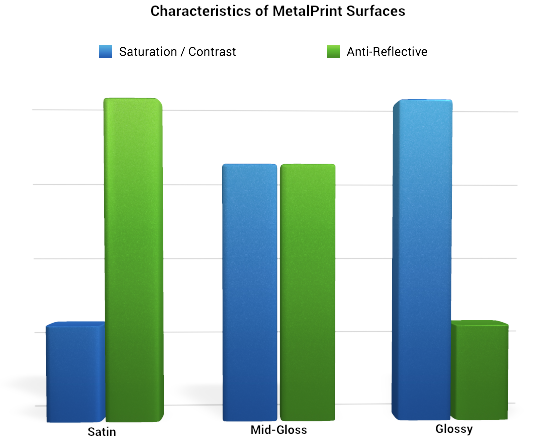
Alright, enough background, let’s get on with the review. To keep things simple I’m only going to compare Mid-Gloss to Glossy. I didn’t bother ordering a Satin MetalPrint because I’m not a particular fan of them due to their horrible color saturation and lack of contrast. Previously I printed my photo “Bonsai Milk” in Glossy and last week I received a Mid-Gloss version of it.
The Review:
Let me start off by saying this: I’m impressed. I’ve always loved Glossy MetalPrints because of their awesome saturation and contrast but I’ve always hated how many reflections they’ve had. Satin looked too flat to me. Mid-Gloss, though, has almost the best of both. The color saturation looks great, the details are superb, the black levels pretty good, and the reflections almost non-existent. Mid-Gloss didn’t have quite the saturation of Glossy but it was pretty darn close. Throw in the fact that there’s very few reflections and the details in the Mid-Gloss print are much more visible and distraction free. Let’s show you some samples.
For these samples I hung the photos on a white(‘i: wall and set the tripod perpendicular to the photo. There was a CFL lamp behind the camera and to the right. I fired a flash from directly behind the camera pointed straight up at the ceiling. The setup stayed the same for all the photos. Let’s take a look:
Reflection:
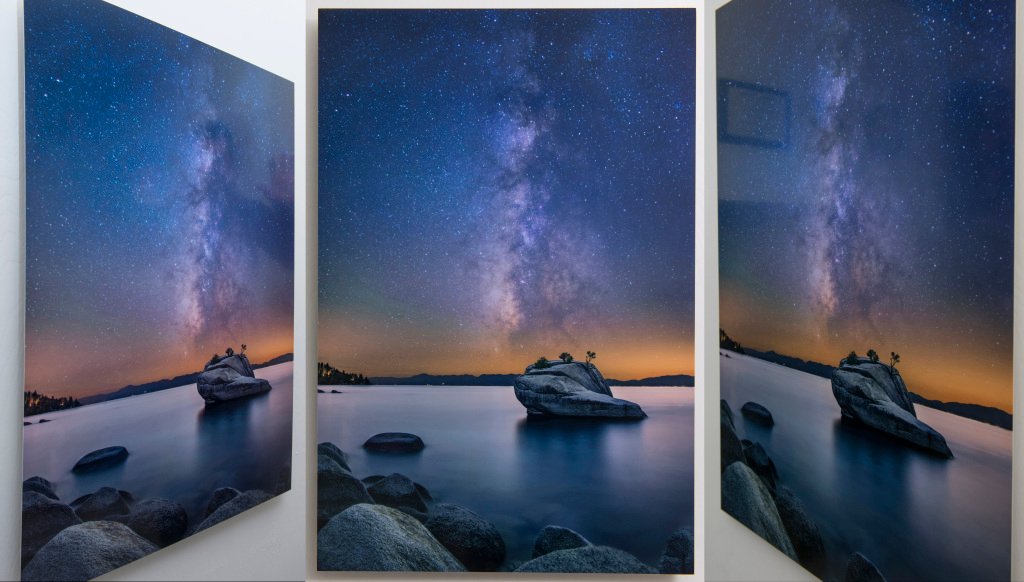
First lets take a look at how reflective the Mid-Gloss is (not very):
What do we see here?
- Straight on the Mid-Gloss is excellent. There are no reflections that can be seen at all.
- Things start to break-down ever so slightly when viewed at an angle.
- On the left image, you can see a reflection of me holding up my hands on the right side of the image.
- On the right image you can see a reflection of a few things hanging on the wall.
- For the most part, though, these reflections are fairly faint.
Let’s compare these reflections to those of the Glossy:

Here is where we start to see how much less reflective the Mid-Gloss is. From these sample you can see that Glossy has much more apparent reflections
- Straight on we can see reflections start to creep in. My tripod, for example, can be seen in the lower-left portion of the photo
- Viewed from the sides, reflections are more prevalent then Mid-Gloss.
- Left Photo: You can make out much more of the reflection of me and my arms in the Glossy.
- Right photo: the items hanging on my wall are much more visible, as is a bookshelf which wasn’t evident in the mid-gloss at all.
- The reflections on Glossy are much more distracting.
Thoughts: It’s quite clear that Mid-Gloss is the winner, with much less reflection. Additionally, you can see with similar settings on my camera, that the color saturation and contrast of the Mid-Gloss is pretty dang good as well. We’re not sacrificing much to get the huge improvements in anti-reflectivity. Speaking of color … let’s take a closer look…
Color Saturation and Contrast:
Glossy is always going to be the king of color saturation and contrast — it’s going to pop the most and have the deepest blacks but how far behind is Mid-Gloss? After all who cares if Mid-Gloss has good anti-reflectivity if its color is poor? We’ve already seen, above, that color saturation and contrast is pretty good in Mid-Gloss but lets take a closer look. I hung the 2 photos side-by-side and used 1-photo to compare the color, saturation and contrast of the 2 photos:
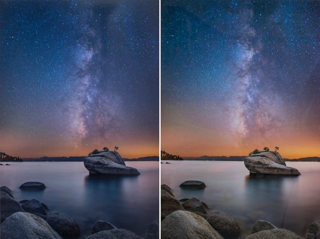
As we would expect, the Mid-Gloss (left) falls behind the Glossy (right). The Mid-Gloss is slightly darker, has a cooler temperature, and slightly more greens. The orange color doesn’t pop as well as the Glossy version. The rocks in the lower portion of the photo appear more blue. Bay Photo received the same image file but if the printers were calibrated differently it could account for the variation. This is a slightly flawed test: the best way to compare the actual color would have been to order the 2 at the same time, not spread out over a year. However, we can still take a few things away:
- Color Saturation of the Mid-Gloss is pretty good. You can still see the colors popping here, just not as much.
- Contrast is really good. The Milky Way is slightly flatter but not by much.
- Black levels are also really good. Just look at the area under Bonsai Rock and around the foreground rocks … they’re just as black, if not more, than the Glossy.
Thoughts: Although Glossy wins in the color saturation department the Mid-Gloss isn’t very far behind. Although we’ve lost some of its pop it still retained a good amount of color pop and the contrast is quite good.
Conclusions:
Mid-Gloss is quite excellent and will become my new MetalPrint of choice. The fact that it has excellent color saturation and contrast while having very few reflections make it the clear MetalPrint of choice!
Some More Samples:
Not satisfied that these quick samples gave a good representation of the reflectivity, I moved the Glossy and Mid-Gloss photos to my dining room where there’s a lot more lighting and clutter to reflect. Here’s how they faired:
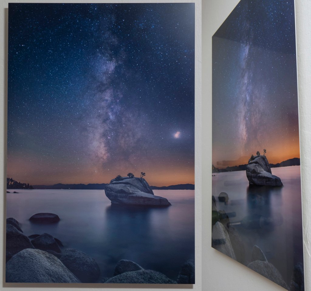
Again, straight on the Mid-Gloss is pretty good. From the side you can start to see reflections of the wine-bottles on the left wall, as well as an outline of the actual wall itself (on the top of the photo). Comparing this to the Glossy:
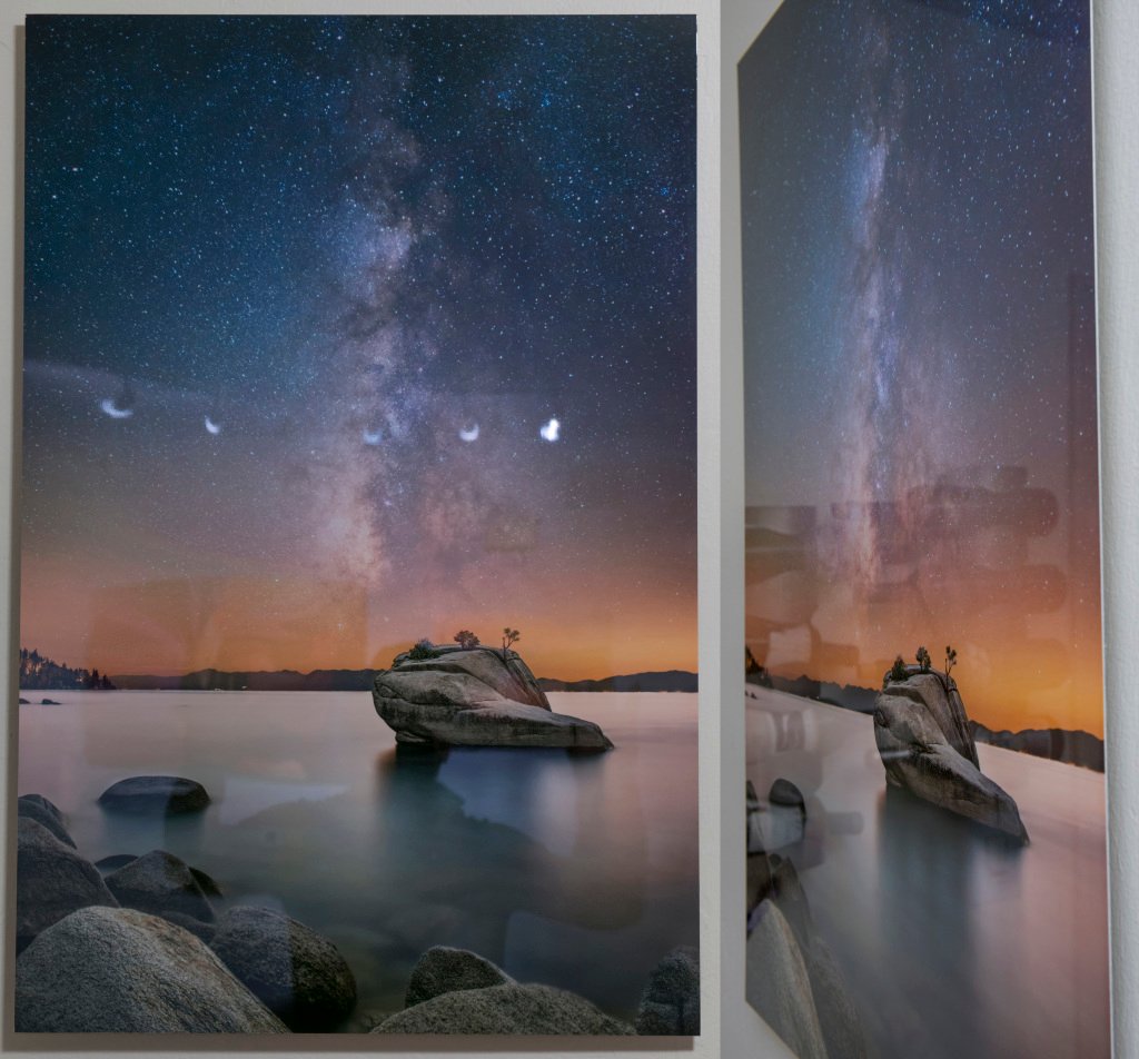
Again we can see a lot more reflection in the glossy. Straight on you can see the reflection of me in the photo, as well as some other items on the wall behind me. The track lighting from the living room appears as little moon’s. From the side we see a lot more of the wine bottles as they become more distracting.
Additional Images can be found at http://www.aaronmphotography.com/Other/Reviews/Mid-Gloss-Review/
